My world view is shaped by the way art offers – maybe even demands – a new way of seeing. The ethereal textures of Vincent Van Gogh’s Starry Night, the rebellion of Salvador Dali’s Persistence of Memory, and even the way Tim Burton’s film The Nightmare Before Christmas draws out familiar human emotions in a world apart from “normalcy.” This new way of seeing drives me in my art, my professional design work, and my life, as I work from the most out-of-the-box solutions and refine them until the goal is accomplished and aesthetics are sufficiently honored.
These early-life art inspirations are a strong foundation on which I’ve added design influences discovered in my studies. The minimalism and simplicity of Massimo Vignelli, with the idea that designing one thing enables one to design everything stirred my creativity and strengthened my roots. I truly believe Vignelli’s philosophy that in order for a designer to understand and find personal strengths, all design forms must be explored. I strive to craft my own work with an air of simplicity and a solid (and growing) understanding of semantics, syntax, and pragmatics. Combining the mid-century Swiss emphasis of research and analysis, plus tapping into creative emotion makes it possible to use old designs in new ways, and create new solutions to problems both new and old.
Strengthening my developing roots, Wassily Kandinsky’s multi-sensory painted compositions inspire me through my internal auditory understanding and cause me to seek after the deeper and broader messages conveyed in every type of design. These messages reflect in his teachings at Bauhaus and move me further in my desires to unite art with the often-mundane parts of life all around me.
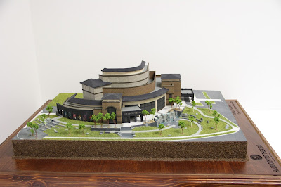
Logos and product identities surround us, but distilling them to their essential elements allows the designer to emphasize the importance of aesthetics in the everyday. This was my goal with the commodity design and branding project, underscoring the classic simplistic significance of gold. Exploring Ireland Monthly conjures memories of my own travels in the Emerald Isle, and transports the reader without fuss or impediment. The real-world designs I’ve collaborated on with my colleagues at WhiteClouds, including the BYU and Hale Center Theatre projects, help to communicate volumes in a visual and tactile way, and have taught me the value of detail and how it can often help, but sometimes hinder the message. The combination of my foundational influences - the complexity of Burton and Dali, the simplicity of Vignelli, and the emotional passion of Kandinsky all drive me further in my pursuit of a new way of seeing. I look forward to expanding on my foundations and solving new problems in the BFA program at Weber State.


